Showing posts with label techniques. Show all posts

06 October 2012

Cover Play

I had so much fun making this cover for my (daily) written journal. The old-skool, composition notebooks are my top choice for the size, the value and for the durable binding that allows the cover to be folded backwards for support while writing.

Simply done with:
  • composition notebook
  • chipboard letters/numbers (or make some) and tacky glue
  • aluminum foil and modge podge 
  • 2 colors of acrylic paint (white + a mid-tone)
  • add black acrylic paint, allow to semi-dry, then remove from surfaces
  • requires touch-up where paint gets removed 
  • rub-n-buff or any metallic paint to add highlights
  • i used glossy accents for my chipboard "slide mount." .. or any embellishment.

Yep, super simple and look at the results  P.S. and charlie helped!


19 February 2012

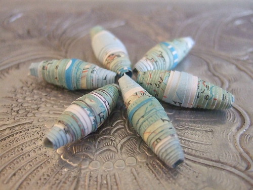
Paper Beads from Vintage Maps

1st attempt! WIP by cookievf
1st attempt! WIP, a photo by cookievf on Flickr.

As a part time jewelry designer, this is a great solution to finding just the RIGHT color!

A "WIP," I will be making a few more sizes and shapes, in a similar color palette, to be paired with a cream-colored dogwood flower pendant. For added sparkle, Swarovski crystal bicone (beads) in teal sound just about right!

03 December 2011

Art Journal Page 2Dec11

A few weeks ago, I decided to prep a few pages in my 8x5 moleskine sketchbook to help jump-start the journaling process. I started with a light application of white gesso, used a babywipe to blend in neocolor II wax crayons and stamped a repeating image with black staz-on.

Next I glued the photo in place and covered the left side with clear gesso. This helps to remove any sticky residue left behind, protects the 1st layer of color and adds texture, or "tooth."

Last night I finished this simple spread with a few doodles, a mhendi-style mandala and some random thoughts on my love of LETTERING. These finishing touches were inspired by Samantha Kira's cool, new email-based class, called Journaling Deep! This is a year-long class which costs only $10/month... and you can opt out at any time... or not! So, please be sure to check out a few of her (57) videos, here.

Sakura Pens used:
Gelly Roll MED White
Gelly Roll Metallic
Gelly Roll Souffle (kind of a mint green)

Bic Pen

28 November 2011

Technique: background layers


- PAINT/GESSO: the page started with an acrylic paint mix of a fairly bright turquoise blue & neon red which became this very interesting blue/grey. next i used a credit card to scrape a thin layer of white gesso,
- NEGATIVE STENCIL: once the 2 layers were fairly dry, I used this technique with an alpha stencil, a spray bottle, baby wipe & a paper towel. You can see the vertical "W V" in the center on the left side.
- BIC PEN: traced a different (backward) alpha stencil with a pen
- COLLAGE: cut, glued and painted several shapes from a found postcard. small pc of sheet music.
- PAINT MARKER: traced a third stencil using a mechanical pencil, due to it's small size then traced over it with a red Sharpie Paint Marker.
- NEO COLOR II: don't you just love the rich pigment of this crayon set? Used a wet application of orange for the border.

10 September 2011

Art Journal Fodder: Craft Foam


Thrift shop find!

Cut from a sheet of craft foam, there are two ways to play peek-a-boo! You can choose to reveal the POSITIVE/stamp or the NEGATIVE/stencil (or BOTH).

To use as a stencil, simply fill a spray bottle with watered-down paint or dilute alcohol ink in a small amount of household rubbing alcohol. To use as a stamp, brayer or use your fingers to spread a thin layer of paint onto a smooth surface, I use a 8x8" ceramic tile, press and stamp!

Tools used: pen, craft knife with a fresh blade and an "anywhere" punch!

27 August 2011

Art Journal Page 7Aug11


STEPS 1 + 2
Paint! Whoever said, "once you use paint in your art journals, it becomes addicting," was right! There's nothing more fulfilling than laying down that first layer of color, usually after I've applied a layer of gesso with a cheapo "chip brush."

APPLICATION
I prefer to use a credit card to apply my acrylic paint because it's fast, clean-up is easy (keep a shallow bowl near-by, filled partially with water - or clean off immediately with a baby wipe or a rag), you use less paint and the BEST PART is that your pages won't stick. Rather than wasting leftover paint, just scrape it onto future pages (see my next post!)

TECHNIQUE
Start with a lighter color. Then, after scraping the 1st layer of paint across your page, scrape a dark or medium shade overtop of it. Next, use your fingers to drip random drops from a glass of water or block the nozzle on a spray bottle with a finger, for larger "glops!" Wait about 1 minute, blot the excess water with a paper towel and SCRAPE to reveal the lighter color underneath. Keep adding water, as needed.

LAYERS
Paper and I have always had this love affair. 10 years ago, i referred to myself as a "paper artist" and I've got a room-full to show for it! Vintage magazines, nat geo (used here), old dictionaries, ledgers, primary schoolbooks, ephemera, postcards, cab cards, sheet music, scrapbook paper, cardstock... the list goes on. So! it's super fun to incorporate that extra layer either before or after gesso or in between paint layers.

Another layer that's a must for me is using handcarved stamps and grabbing something from my "mark making" collection such as bubble wrap, sequin waste (used here), old shower curtain grommets, corks (used here)...


05 August 2011

Art Journal Page 18Jul11

painted a wash of green paint over a self-portrait,


"crackle" rubber stamp cube, in brown ink,


torn pieces of vintage wallpaper,


new fave color duct tape,


deco tape,


pink porfolio oil pastel,


applied molding paste with corrugated cardboard for texture.

29 July 2011

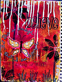
Art Journal Page 13Jul11


Products/techniques used:
- Gesso is always my first layer.
TIP: I prep all of my pages with gesso first for several reasons. 1) Using a "chip brush" gives me added texture, 2) laying down a solid, opaque white base makes my colors POP, 3) gesso prevents the paint from soaking into the paper so, again, more pigment is visible.

- Several layers of acrylic paint were scraped on with a credit card.


TIP: If you don't want your colors to blend, sometimes creating a muddy appearance or (GASP!) turning brown, then use a blowdryer or heat gun drying each layer of paint completely. This will ensure that each color remains pure.


- Bubble wrap or sequin waste!


- I added the white drips across the top of the page using Speedball white calligraphy ink.
TIP:
Blowing paint or ink drips with a straw helps to spread it out and pushes the liquid further down the page.

- The butterfly wings are torn vintage ledger paper and are colored with sharpie "metallic" and poster paint pens.

- Just above "take a leap" I applied several strips that I cut out of a magazine ad.

TIP: I always try to use collage for added texture and layers. If you adhere them with gel medium or mod podge, be sure to cover the top as well. After painting over collaged bits, this gives you the option of wiping some of it away allowing some of the image to show through. Clear gesso works also.

- I used a hand-carved petal stamp to make the flowers with black staz-on ink.

- The flower stems and grass are portfolio (water soluble) wax pastels.
TIP:
For a softer look, you can paint over portfolios with a wet paintbrush. Or you can leave them AS IS, like I did, for more of a handmade, distressed, even childlike effect.

- The text around the butterfly was written using a silver metallic sharpie and outlined with a Pigma micron pen.

- Alphabet stamps for "take a leap of faith" are Sunny Lower Case by Hero Arts.

TIP: When stamping letters, to avoid running off of the right edge of a page, start at the edge and work backwards. To center text or a title, stamp the middle letter and work outwards.

Have fun and be sure to leave a comment if you try one of these tips!
Please feel free to share one of YOUR favorite tricks/tips?


29 May 2011

Technique: Painted Paper Backgrounds

Why did I wait so long to try this!!? A few months ago, I purchased a pack of delicious paste paper scraps from Albie Smith and my interest was officially piqued. Some benefits of creating your own designs are:

  • Choose your own colors,

  • Patterns,

  • Paper Weight

  • Save money

  • Relaxing/Zen/Freeing

  • Experiment with new painting techniques for your "artist's toolbox"

  • Fun

  • I would have to say, the best part of creating my own papers for use in mixed media collage, is how free it feels to simply CHECK OUT and let your right brain take over... something we can all do more of. It can be the perfect exercise in LETTING GO and although I try to work intuitively in all mediums, it's so easy to just "give in to the process" while painting backgrounds!

    Take the RIGHT BRAIN vs LEFT BRAIN creativity test.

    Any type of paper will do. You can either make paste paper with Elmer’s Art Paste at Dick Blick's or whip up a home recipe of 6 cups boiling water, 1 cup of flour, strainer, as many covered (yogurt-etc) containers as paint colors desired. Begin by bringing 5 cups of water to a boil, mix flour with 1 remaining cup of water and add to (dedicated) saucepan. Turn off and stir to thicken. Add to containers along with acrylic paint. Stencil, layer, sgraffito, drip, spray, use mark-making tools (a fave).. the sky's the limit! Be sure to check out YouTube for more detailed information or my new friend Barb Owen's paste paper Vid on USTREAM!

    My first 3 pages were made on blank newsprint sheets with cheap acrylic paint, a straw, a lid and a plastic gift card:


    “If you hear a voice within you saying, ''You are not a painter,'' then by all means paint… and that voice will be silenced.” - Vincent van Gogh

    26 May 2011

    Art Journal Page: 29Apr11

    Recently having been bitten by the art journaling "bug," I took my book on our first trip to boston this year for a Red Sox game in april. The first pic shows this page in its RAW FORM having doodled in bed for two hours around 1 AM!! Later at home, I carefully taped over the writing with painter's (no-stick) tape and went crazy with my acrylic craft paints, using a homemade stamp around the border. The most fun? removing the tape!!

    TEXT: "I trust my own perceptions. I receive your good willingly. This is my prayer. Believing in myslef and my abilities, finding strength internally, not depending on others for validation. I am worth taking the time and making the effort."


    17 May 2011

    A Return to Cardmaking

    January 2011 was catharctic for me. I made a plan to put my jewelry making on the backburner for a few months and take the winter off to focus on making ART AGAIN! The real change began in November when I reorganized my neglected studio space and that's when I couldn't ignore the "call to return" growing louder and louder, inside of me... (actually it was SCREAMING) so I listened.

    A mother's day card that started with a new ATC, a quotation from a book on Roses and a pretty pink rose "popped" on top of a piece of foam tape and sprinkled with some german glass glitter. The final touch was a length of vintage handmade lace from one of my ancestors.. believed to be made by my great-grandmother, Laura Adella Murphy Farquhar (1859-1911) pictured below.


    07 May 2011

    Journal Page Technique: Citra Solv

    Citra-solv! I love the "painterly" effects when you spritz this household cleaner onto photos in National Geographic. I don't know what makes it work, but someone/somewhere discovered that it reacts to the special inks that are used (thank you, someone). The New York Times Magazine was also mentioned in a post, which i have yet to try..

    Lots and lots of resources all over the place for learning more. There's a facebook page, website with gallery and tutorial, tons of youtube fodder and be sure to check out another great resource at stampington for this video, as well as a gallery plus you can buy it from their online shop as well!

    I follow the basic process of spraying the solvent onto the photograph, waiting a hot minute and wiping with a paper napkin or babywipe. As you can see, the solvent was applied right to the already assembled page.

    Simple doodling with 3 Sharpie "Poster Paint" pens, journaled with same.. which turned out to give a really fab contrast to the black gesso.

    ...Now it's your turn TO GET DIRTY (my term for creating art!) and MAKE SOMETHING BEAUTIFUL!

    18 March 2011

    Layers and Detail

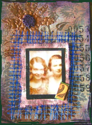
    best friends forever ATC by cookievf
    best friends forever ATC a photo by cookievf on Flickr.

    I came across the following description while glancing through some of my older pics on Flickr. Clearly, I document process & technique for sharing and for the fun i get out of looking back at something I created a few years ago.

    "Truthfully, you don't realize how much work goes into these tiny treasures until you list ALL OF THE STEPS it took to create it!

    13 Steps:
    - patterned paper background,
    - 2-3 colors distress ink
    - taped to pre-printed "BACK" (name/date/email)
    - stamped flower using clear ink,
    - heat-embossed with copper - embossing powder,
    - glued number transparency to background.
    - matted printed photo onto torn vintage book page,
    - distressed with ink
    - cut square of blue mesh
    - "popped" to card with foam tape.
    - glued cardboard number
    - edged with black sharpie
    - glued purple microbeads to flower center

    best friends forever ATC - created 0309"

    08 March 2011

    TECHNIQUE: image transfer


    There are a variety of ways to accomplish an image transfer, one of my very favorite techniques. I have achieved good results with a range of products, and have had equal success with both golden acrylic soft gel (matte), 8oz $10.22 USD and royal coat decoupage SATIN , 8 oz. $5.12 USD.

    So far, I've used these five methods.

    (1) TRANSPARENCY. print image onto a sheet of ink-jet transparency film, (spray with fixative) select a background and paint surface with a layer of soft gel. Place transparency ink-side down and brayer. peel back a corner to check your progress.. when image has (mostly) transferred - remove!

    (2) GEL SKIN. First, select your image and cut it out. Apply soft gel like you're spreading butter on toast. let dry. repeat 5-10 times. roughen back with sandpaper, moisten with water & rub off paper backing with fingers.

    (3) MY STANDARD. select a printed image and a background, apply a generous layer of soft gel to both and brayer for full saturation and coverage. Wait 1-2 minutes! Then peel back a corner to check your progress.. when image has (mostly) transferred - remove! Toner images work best but with trial-and-effort, meaning different sources for images, different substrates & varied drying time, (even FABRIC), you'll find there are MANY options. I have had most success with this method using vintage ledger paper.

    (4) STANDARD. same as above but instead of peeling the image away from the background page, use sandpaper to roughen, moisten with water and rub backing off with fingers.

    (5) PACKING TAPE. Select and cut out an image from a magazine or brochure. Apply as many strips of packing tape needed to cover completely. Submerge in warm water and remove once you're able to rub paper off with your fingers, sanding to roughen as that helps to get it started (but be careful, as always, not to remove too much). SOME MAGAZINES work better than others, so keep searching & testing... I can promise you that, as in life, the reward is worth the effort!

    The trick with ALL of these methods is that the darker colors become more opaque while the lighter areas allow your background to show through. Be aware that text will appear reversed except when using gel skin and packing tape, where the "positive" image is used.

    Here a few photos to illustrate the gel skin process:


    In pic#5, you see a crisp, transparent image however, the final step in my journal shows a "milky" uneven finish to my transfer. An "ooops!" - here's what happened: instead of JUST spraying the back and rubbing the paper off.. I first dipped the image (with 8 layers of dry Royal Coat satin) into a tub of water for a few minutes - and that was my mistake. The front turned completely opaque and I was forced to use the reverse side which still retained a fine film of paper, no mater how hard I tried to remove it, even glaze it. LESSON: reserve the dipping step for packing tape transfers! Don't be afraid to make mistakes because trial-and-error is part of streching yourself creatively!


    No art is bad art!


    Mother's Day card 2009 made with gel skin method, described above. I cut-away the card behind the image, to show its transparent qualities, which is shown from the reverse at the beginning of this post.