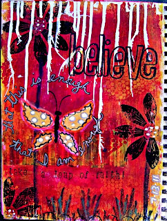
Products/techniques used:
- Gesso is always my first layer.
TIP: I prep all of my pages with gesso first for several reasons. 1) Using a "chip brush" gives me added texture, 2) laying down a solid, opaque white base makes my colors POP, 3) gesso prevents the paint from soaking into the paper so, again, more pigment is visible.
- Several layers of acrylic paint were scraped on with a credit card.
TIP: If you don't want your colors to blend, sometimes creating a muddy appearance or (GASP!) turning brown, then use a blowdryer or heat gun drying each layer of paint completely. This will ensure that each color remains pure.
- Bubble wrap or sequin waste!
- I added the white drips across the top of the page using Speedball white calligraphy ink.
TIP: Blowing paint or ink drips with a straw helps to spread it out and pushes the liquid further down the page.
- The butterfly wings are torn vintage ledger paper and are colored with sharpie "metallic" and poster paint pens.
- Just above "take a leap" I applied several strips that I cut out of a magazine ad.
TIP: I always try to use collage for added texture and layers. If you adhere them with gel medium or mod podge, be sure to cover the top as well. After painting over collaged bits, this gives you the option of wiping some of it away allowing some of the image to show through. Clear gesso works also.
- I used a hand-carved petal stamp to make the flowers with black staz-on ink.
- The flower stems and grass are portfolio (water soluble) wax pastels.
TIP: For a softer look, you can paint over portfolios with a wet paintbrush. Or you can leave them AS IS, like I did, for more of a handmade, distressed, even childlike effect.
- The text around the butterfly was written using a silver metallic sharpie and outlined with a Pigma micron pen.
- Alphabet stamps for "take a leap of faith" are Sunny Lower Case by Hero Arts.
TIP: When stamping letters, to avoid running off of the right edge of a page, start at the edge and work backwards. To center text or a title, stamp the middle letter and work outwards.
Have fun and be sure to leave a comment if you try one of these tips!
Please feel free to share one of YOUR favorite tricks/tips?


3 comments:
A lovely journal page with cool techniques! I keep saying I'm journal challenged (I am!) and I need to get over it and commit - ha!
Jessi
I love this page it is so vibrant and uplifting.
Total Knockout!!Love all that yummy texture!!Hugs,Cat
Post a Comment