29 April 2007

Transfer Techniques to Share


I combined two NEW techniques to make this card. The first one is from Bernie Berlin's new book "Artist Trading Card Workshop" and she calls it Inky Layers. Very simple. Just tear various paper bits such as sheet music, reprinted vintage ads, pages from old books, etc. Ink the edges of some and decoupage to a blank ATC. Then mix yellow acrylic paint with clear glaze from Making Memories and apply with a baby wipe. For the next step, I added ink using direct-to-paper with my red (colorbox chalk) cat-eye ink pad and a metallic lavender Brilliance ink pad. Note that some papers were brown, to begin with.

Next I took a black & white image that I printed with my Canon Pixma iP6000D inkjet printer using my favorite paper by OptiJet. It's called Photo Resolution Coated Paper - Matte. I actually believe this will work on ANY type of thin white paper. After cutting around the face, I added about 6 layers of gel medium, drying between each application, spritzed water on the back and slowly and carefully rubbed the paper & the "bloom" from the back of the image.

The final touches were gluing on a transparency phrase and adding a dragonfly brad then sealed it with a triple high gloss "glaze" for protection and added dimension. A favorite touch!

FUN...EASY...BEAUTIFUL RESULT! Why don't you try it?

Another gel medium transfer

Title: "Hearts A-Flutter"

28 April 2007

FAIRIES!


Through the mists of time, fairies and the like ~ sprites, elves, pixies, brownies and other tiny magical beings ~ have inspired our imaginations, stolen our hearts and populated our bedtime stories. This is an illustration by Eleanor Vere Boyle (British 1825-1916) from a story titled "Thumbelina" in the late nineteenth century children's book, "Fairy Tales by Hans Christian Anderson" published in 1872.

An excerpt from this well-loved fairytale:

"What a lovely flower!", said the woman, and she kissed its beautiful red-and-yellow petals. But the moment that she kissed it, the flower burst open with with a loud snap. Anyone could see it really was a tulip, but there was a tiny little girl, very delicate and sweet, sitting in the middle of the flower on its green center. She was no bigger than your thumb, and so she was called Thumbelina.

She was given a prettily lacquered walnut shell for a cradle, and she lay there on blue-violet petals, with a rose petal coverlet over her..."

I hope this inspires you to include a picture of a vintage fairy in one of your creations this week!

23 April 2007

15 years and counting

We are so blessed to have our precious cat, Satch in our lives. He and his brother, Sam were rescued at 4 months old. Satch turned 15 in March and Sam lived to the ripe, old age of 14. He died peacefully in our arms one night in Feb 2006 with all four of us present. We miss you, "little!"

Just a few hours ago, at 10 PM.... and every monday night, we light a candle for little Sam. Read more about the Monday Candle Ceremony. Be sure to scroll down and read "The Rainbow Bridge" story. It's very, very heartwarming!

Our prayer tonight includes all pets that are suffering in ANY way and all pet owners that are newly bereaved or those remembering beloved pets of long ago. As the link above explains, it is celebrated INTERNATIONALLY and it is my hope that you will share this with your friends and pass it on! This weekly tradition continues to be a great comfort to us to know that we are honoring, not only Sam, but ALL pets and their families.

As I turn in for the night with Satch, signing off on my latest blog, I cherish EVERY DAY we have left to spend together! God certainly knew what he was doing when he created companion animals!

(update: 12/8/07 Satch is almost 16 and still THRIVING, diabetes and ALL!)


XOXOXOX

Sam:
Photo Sharing and Video Hosting at Photobucket

Photo Sharing and Video Hosting at Photobucket

The Boys, 1 year old:
Photo Sharing and Video Hosting at Photobucket

15 April 2007

..the man of my dreams


This ATC was made using a "packing tape transfer" for the image of Marlon Brando. The background text is part of a vintage ad that I printed from a (lunagirl.com) ephemera CD.

I used a Making Memories date stamp kit, rubber stamped the right-hand border then glued the text and other paper items followed by a coat of glaze. A black sharpie was used to define the edges.


13 April 2007

Be Mysterious!


This is a birthday card I made for a friend by simply mounting an ATC I made last week using clear photo corners. This way it's removable or she can keep the card "as is. I titled it "Be Mysterious" since the face is obscured by clear microbeads. A fun touch to add to artwork. I have also used them to cover an image inside of a bottlecap or colored beads just as an edge detail.

09 April 2007

the secret


The law of attraction is nothing new! It simply describes how thoughts create reality. What you think literally becomes your life. A quote from the book, The Secret - by rhonda byrne states "It is YOU placing your order with the Universe. It's really that easy." - Dr. Joe Vitale

Another excerpt:
"There is no blackboard in the sky on which God as written your purpose, your mission in life...your purpose is what you say it is. Your mission is the mission you give yourself. Your life will be what you create it to be..." - Neale Donald Walsch

Personally, I haven't read this book but fully believe in it's message! With close to 1,000 customer reviews on Amazon maybe it's worth dropping by to read a few of them. I've heard it can be life-altering!!

....or maybe just go alter an altoid tin!

Whatever you decide LET YOUR LIFE SPEAK!

05 April 2007

A Mid-Summer's Dream

Photo Sharing and Video Hosting at Photobucket

A cherished time of year for me is when the warmer weather (finally) arrives here in New England. Why? Because DH and I will be grilling, napping, reading, watching Red Sox baseball and yes, crafting - on our screened-in porch! Besides the early morning, my second favorite time of day (being the MOLE that I am, ...smile!) is after dark. That is when I light several candles, turn on the "party lights" and listen to the nocturnal chorus of crickets, tree frogs, owls, and the families of raccoons, possums and squirrels that love to forage in our woods! I am counting the days, hours and MINUTES until that time arrives!

I wanted to include this shot that shows the full view up to the rafters in the ceiling (my design), but L-O-L, look closely at the right foreground! All of my papers and things are spread out on the table. That porch is a great resource for inspiration! Why not stop by some warm summer evening? I'll make the marguerita punch, you bring your latest art project to work on!

04 April 2007

Selected for Paper Trader's Homepage

It's hard to put into words how I felt this past weekend when I signed in to my Yahoo Group, Paper Traders, and read "Front page art work by member: Vicki Cook." This is the card that was chosen. It really is a place of honor and makes my day every time I visit!!

The central image is from a collage sheet titled "Kodachrome." I loved the vibrant shade of pink and decided to draw attention to it by using a muted color palette for the rest of the card. The background paper is a vintage label, also printed from a collage CD. The phrase was cut out of a "bodice ripper" paperback which I learned are GREAT for cutting up and using on ATCs. (bodice ripper is an american expression for a novel full of unrestrained romantic passion)

After gluing the paper items I added 4 pink sequins, stamped the stars and rubbed the edges with a red "distress" inkpad from Ranger - a product which is a personal favorite of mine. The card was finished by coating it with a high gloss glaze to protect the card as well as adding dimension.

03 April 2007

blue bird of happiness!


Looking through my ATC collection, I came across this sweet little card. I hope it will bring a smile to some of my fellow bloggers today!

This shade of BLUE is such an uplifting color for me. I think you'll like it too! (do you see a trend here? yet another alcohol ink background!)

It's nice to take a break from the muted shades and the distressed finishes that so many of us enjoy, myself included.

What shade or hue is your "color inspiration" today? ......I hope this has you thinking!

28 March 2007

"adore" ~ alcohol inks on a playing card


This is an example of an alcohol ink background. If you haven't tried this technique yet, you are in for a treat! (I will be blogging a basic "how-to" in the next several days) And trust me, they are IMPOSSIBLE to duplicate! This is also what makes them so beautiful - they are absolutely one-of-a-kind-UNIQUE! Because of this, it was suggested to me, if you want several cards to have a similar "look" - line them up in multiples and layer your colors as if you were working on a single card.

Most of my ATCs are made using playing cards. I find that it not only saves time cutting, but they provide a sturdy base with a nice substantial weight or feel to them.

I've purchased white cardstock "ATC blanks" in sets of 50 - 100 and have been QUITE disappointed with how flimsy they are. I feel the same about patterned scrapbook paper, that it lacks sturdiness. But LOTS of artists use pp with stunning results.

Suggestion: buy small quantities of blank ATCs online or in stores, of 10 - 25, and create with them before buying large quantities. (cost is approx $4 per 100) The same goes for matt or illustration board, which could prove to be too heavy or too thick for your liking.

Some artists are quite happy cutting up cereal boxes. I've even tried PIZZA BOXES! All part of the journey!

26 March 2007

mini class at the best stamp store in CT!

These are early experiments with alcohol inks. A clear favorite of mine for ATC backgrounds.

I recently signed up for a 3-day book altering class at a G-R-E-A-T local stamp store in Westport, CT called the: "Great American Stamp Store!" It's going really well and the last class will be held in early April.

While taking this class, taught by the ultra-fantastic "kim," (she teaches TEACHERS) I had the opportunity to meet a really fun group of artists: Susan, Nancy, Lisa & Evelyn. Surprise of surprises I learned that Susan was a member of one of my Yahoo online (ATC Trading) groups!! A small, small world.

So we got to talking and sharing our art of course and it was unanimous that Susan and I would share a few techniques with the group on making ATCs... instructor included! I selected alcohol inks & crackle and Monday we'll learn what Susan will be sharing!

Can't wait!
I am off to prepare for tomorrow. See you all at 6:15! And for the rest of you, hopefully I've inspired you with these 6 cards, to get out your alcohol inks and GET TO WORK!

24 March 2007

.... more from last night!


"pouvez-vous me voir?"....&.... "sun dreams"


"theatre francais" .......&......."party girl"

How Distressing!

I'm on a "kick" ...happens to the best of us! This time it's the shabby / distressed / crackle look.

For me, a KICK usually starts when I come across a new technique, either from my book collection or from a discussion in one of my yahoo groups. This time it all started with crackle (and Marion, you're to blame for that). So, when I can no longer resist the temptation, I make the one hour round-trip to either Michael's or Joanne's (both are sub-par IMO) and buy a new product (crackle medium). That was about 2 weeks ago. Yesterday I ventured out for a second time and bought about 20 bottles of acrylic paint known as SUPPLEMENTAL supplies to feed the growing addiction! (on sale ~ $.50 each.)

Once DH went off to bed (hehe) I spread out the "booty" and this is the result: 2 of the 6 cards that I made!

"Art Fair" was made with two shades of orange acrylic paint with a layer of crackle medium in-between, followed by a stamped "crackle pattern" in black.

"Zig Zag Summer" was made by painting both Plum & Wine acrylic paint separated by a layer of crackle medium. The picture doesn't show much contrast and neither did the original! SO I dabbed on a little bit of white Gesso, and once almost dry and still a little tacky, I sanded it in places.The yellow, star-shaped brads are new, too!

18 March 2007

Tutorial from Luminarte, Inc.

Check out this great tutorial on how to combine Twinkling H2Os with your rubber stamps from Leslie Blackburn Ohnstead, president of Luminarte, Inc.

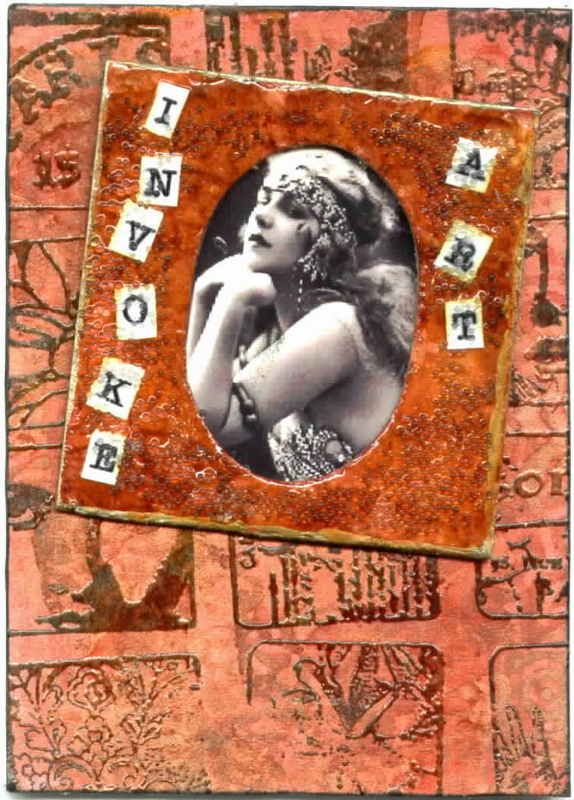
~ how I made this card ~

Supply list: white cardstock blank, Twinkling H2Os, yasutomo waterbrush, black Versamark ink pad, clear embossing powder, collage stamp, clear micro beads, Glossy Accents by Ranger, printed letters, B & W image, glue dots, sharpie, gold paint pen, double-stick tape

The background of this ATC was made by first painting cardstock with Twinkling H2Os in Persimmon. Because there is mica in these shimmering watercolors, the iridescence doesn't completely show up in the scan.

  • Next I stamped a collage stamp in black and embossed with clear embossing powder.
  • Next I dabbed on a little red & yellow alcohol ink for a softer, more distressed look.
  • The same shade of watercolor was used on the slide holder to which I added some cut out letters to spell "INVOKE ART."
  • So as not to compete with the rich color palette, I found a pretty black & white photo to take center stage. I attached it to the back of the slide with double-stick tape, using glue dots to adhere it to the card.
  • Once the surface was completely dry, I spread Glossy Accents (http://www.rangerink.com/) and dropped clear micro beads into the glaze. Gold paint pen was used to edge the slide and a black sharpie to edge the ATC.

Now go find some room on your desk and MAKE something! I'm headed to my studio to "clear a path" which is sad but, oh so true!

16 March 2007

"Christy Girl" - An American Icon

"Vintage Winged Folk"

This is a series I made for an online swap that eventually got lost in the mail! Was my worst nightmare coming true? Thank GOODNESS it eventually turned up ... although a few weeks late for the swap. I was relieved that the hostess was extremely understanding, a sweetheart actually, and quickly returned them to me.

The other good news was that I had more than one artist contact me to trade "Fairy ABCs" (card #5) and "Woman of Mystery" (card #3). Lesson learned ~ all things happen for a reason! Truthfully, sometimes all we need to do is to be a little more patient with ourselves and the true purpose of a particular challenge will reveal itself.

The names of the other 4 cards are, in order: sweet song, *american beauty, vintage angel and love takes flight!

American Beauty has an amazing story behind it. Interested in a little history from the ‘Golden Age of American Illustration’? Grab a cuppa and get comfortable while I spin a little "tale." One that I think you will enjoy reading!

This "girl" was sketched by an American artist named Howard Chandler Christy (1873-1952). At the age of three he was sketching animals and by four his father purchased his first set of watercolors. In 1890 at the age of 17, Christy left his home town of Meigs Creek in Morgan County, Ohio. With $300.00 he set off for New York to pursue a career as an artist. He arrived in New York in 1890 and after some scouting around, enrolled at the Art Students League. William Merritt Chase was his first instructor and also tutored Christy privately at his Greenwich Village studio and later at his summer venue in Shinnecock, Long Island. Chase founded the first "plein air" art school in the country. The artists worked outdoors and were thus able to develop techniques and effects, which created greater ambience in their works. At this time, great technological advances were being made in Publishing. Christy sensed that a new field was opening up for his generation - providing illustrations for the burgeoning number of new periodicals. Reproduction technology evolved to the point where engravings were no longer the sole, tedious and expensive means to reproduce a painting. This inspired the needy young artist to turn to illustration as his profession. Illustration commissions rolled in thereafter and he was soon able to hire models and move his studio to larger quarters.

Established as an illustrator, Christy was moved patriotically by the explosion of the Battleship "Maine" in Cuba and signed on as an artist with the magazines covering the Spanish-American War. He accompanied the United States troops - the Rough Riders - and illustrated articles while under fire, which were published by Scribner's, Harper's, The Century, and Leslie's Weekly. During this campaign, Christy befriended Colonel Theodore Roosevelt and gained an even broader interest in patriotic subjects. Upon his return in 1898, he had become a celebrity from his war illustrations. The experience had been a turning point for him. His fame and reputation were secured with his picture, "The Soldier's Dream" published in Scribners. The girl he portrayed in that and subsequent paintings became known as "The Christy Girl". Like "The Gibson Girl," she was almost a prototype of the ideal American woman.

S. J. Woolf, in an interview, commented on Christy's notion of women: "They represented the awakening female, no longer content to preside over the kitchen, to be forbidden the golf course or the vote. The way Christy drew her, she was popular with the males because of her charm, while the young women liked her because she embodied their dreams of emancipation." Christy also described his image of what this woman was truly like, "High-bred, aristocratic and dainty though not always silken-skirted; a woman with tremendous self-respect. " From this point forward, Christy painted beautiful women for McClure's and other popular magazines. Calendars, book illustrations (some books he authored as well, such as: The Christy Girl, Bobbs-Merrill in 1906; and The American Girl in 1906) and other illustration commissions expanded his audience. Fame and fortune had found the young man from Ohio.
Christy died peacefully in new York at the age of 80 in 1952, in his beloved studio apartment at the Hotel des Artistes. His reputation through-out his life had been enormous and yet scarcely anything remains today, which describes this incredible man and his works.

15 March 2007

Adopt the pace of nature; her secret is patience. Ralph Waldo Emerson


This is a cherished photo taken on a vacation to Cape Cod in September 2004.

Whenever I look at it, not only do I reflect on a perfect day of exploring in Wellfleet, MA... but if I really take a moment to clear my mind... I can almost SMELL the salt in the air, HEAR the gentle surf and FEEL the smooth coolness of a pebble in my hand.

I'm truly grateful for these experiences when the two of us have been "at one" with nature. We feel blessed, rejuvenated and ready to tackle anything that life throws our way!

Do your best to maintain an "attitude of gratitude" and there will always be room for more!

~END OF TODAY'S SERMON~


14 March 2007

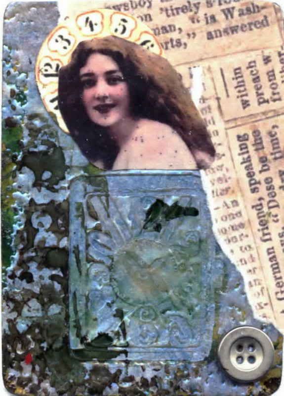
Precious Eternity

Made on 12/8/06, this was my little experiment with UTEE or Ultra Thick Embossing Enamel. I use it in powder form, but have heard of it being "melted" in a pot!?! The product I have is Interference Blue made by Suze Weinberg. I'm anxious to purchase more colors since they can be mixed with a wide variety of results! Caution: they are NOT CHEAP. My jar holds 65 grams and measures about 2" x 2" for $9.25.

To make the card:
  • I took a blank ATC, covering 1/2 with clear "pigment" ink
  • Added 3-4 layers of UTEE, heated with embossing gun
  • Pressed a rubber stamp into it while warm
  • Added blue and green alcohol inks
  • covered the rest of the card with torn paper
  • cut another image, added a halo from a vintage "fortune teller's card"
  • metal embellishment
When I made this card, I had no particular "swap" or "trade" in mind - a rarity for me!! Typically the card would have a pre-determined destination before I even start since I usually make my cards AS NEEDED. So this lovely card was eventually traded to one of my favorite artists, Ingrid Dijkers and I received a beautiful card, in return!

11 March 2007

technique: CRACKLE!!


Let me explain.....

My name is Vicki and I am an ATC addict!
In the early Spring of 2006 I discovered a book, my BIBLE actually, called "Artist Trading Cards - An Anthology of ATCs" which, truthfully, is still a much-used resource. It was put out by a wonderful company devoted to paper crafters, called Stampington & Company (www.stampington.com). My life hasn't been the same since! Just ask my friends and family!

This card, made on 3/5/07, showcases my very first attempt at a crackle technique using the following steps:
  • I painted the card green, let it dry somewhat
  • Spread crackle medium with my fingers. (quick crackle by Duncan)
  • To shorten drying time, I hit it with my embossing gun being careful not to allow the surface to bubble.
  • Added a swipe of gold acrylic paint, used embossing gun again.
  • Then sanded it off. I also added a little bit of Adirondack Mixatives in copper.